NUAGEUXSTUDIO
The studio, in every detail.
Behind the work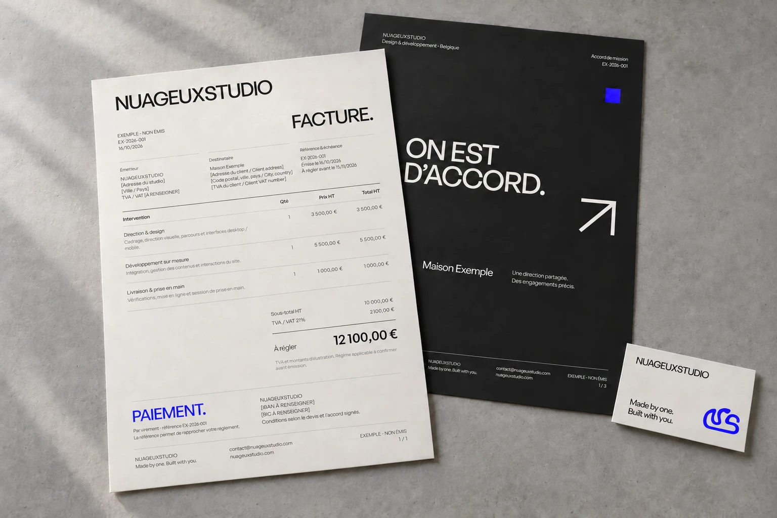
Overview
Recognise the studio before you read its name. This redesign brings the website, documents and client conversations together through one direction: expressive in form, precise in what it says.
- The starting point
- An existing visual identity, with individual touchpoints designed separately. The aim was to carry the same intention from the first visit to the final handover.
- The studio’s role
- Art direction, website design and development, reusable templates and shared design rules. A project for our own studio.
- Deliverables
- A French/English website, design system, proposals, invoices, engagement agreements, onboarding, emails, signatures and social layouts.
- Art direction
- Design system
- Web design & development
- Client experience
Same name.
More presence.
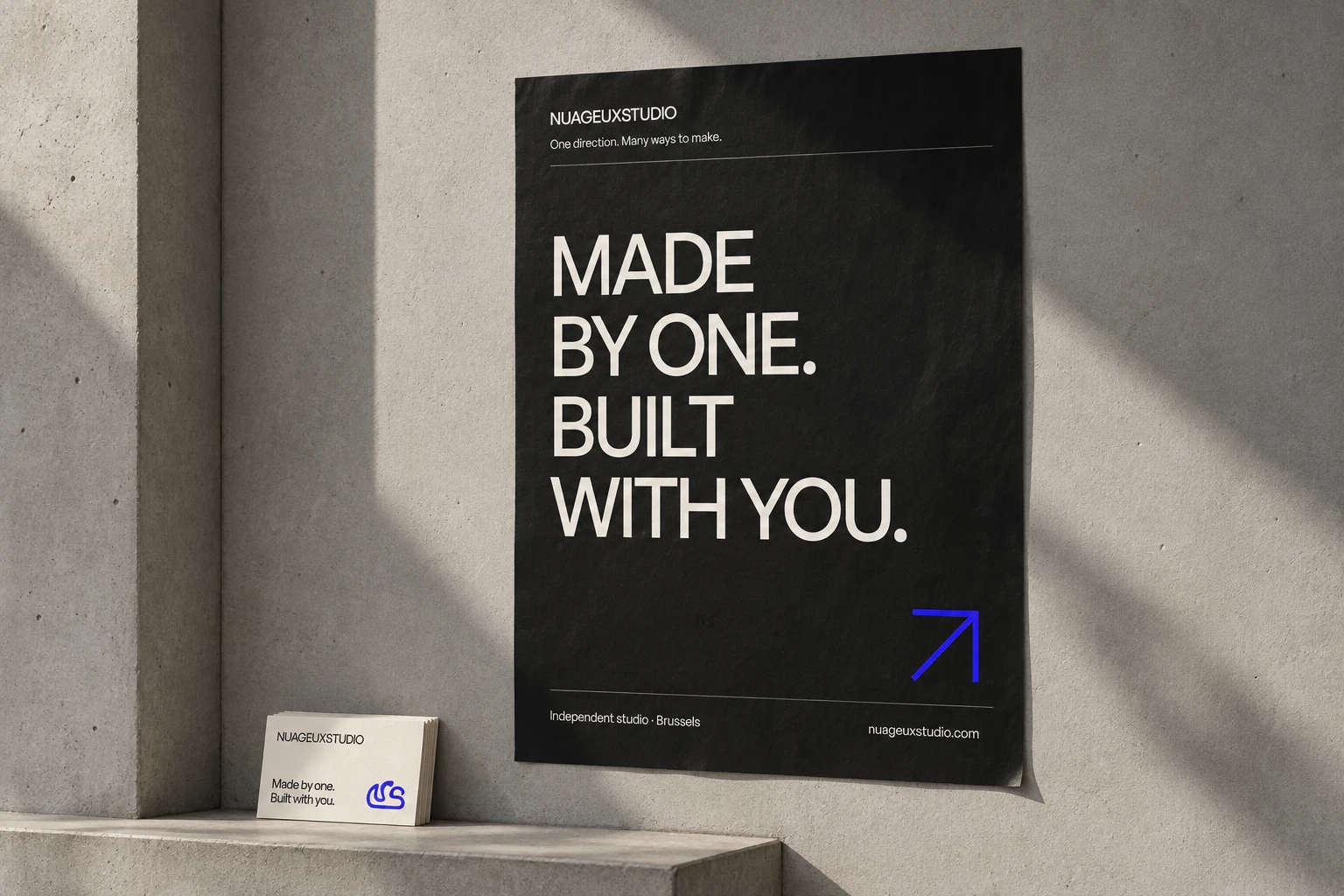
The name, symbol and signature stay. Around them, a single type family, more assertive compositions and an electric blue accent. The identity leaves room for projects with very different personalities.
One type family
General Sans 400 / 500 / 600
Even an invoice
can have character.
Large headings, a clear grid and space to breathe. Proposals, invoices and onboarding documents carry the studio experience forward, while keeping the scope, amounts and next steps easy to find.
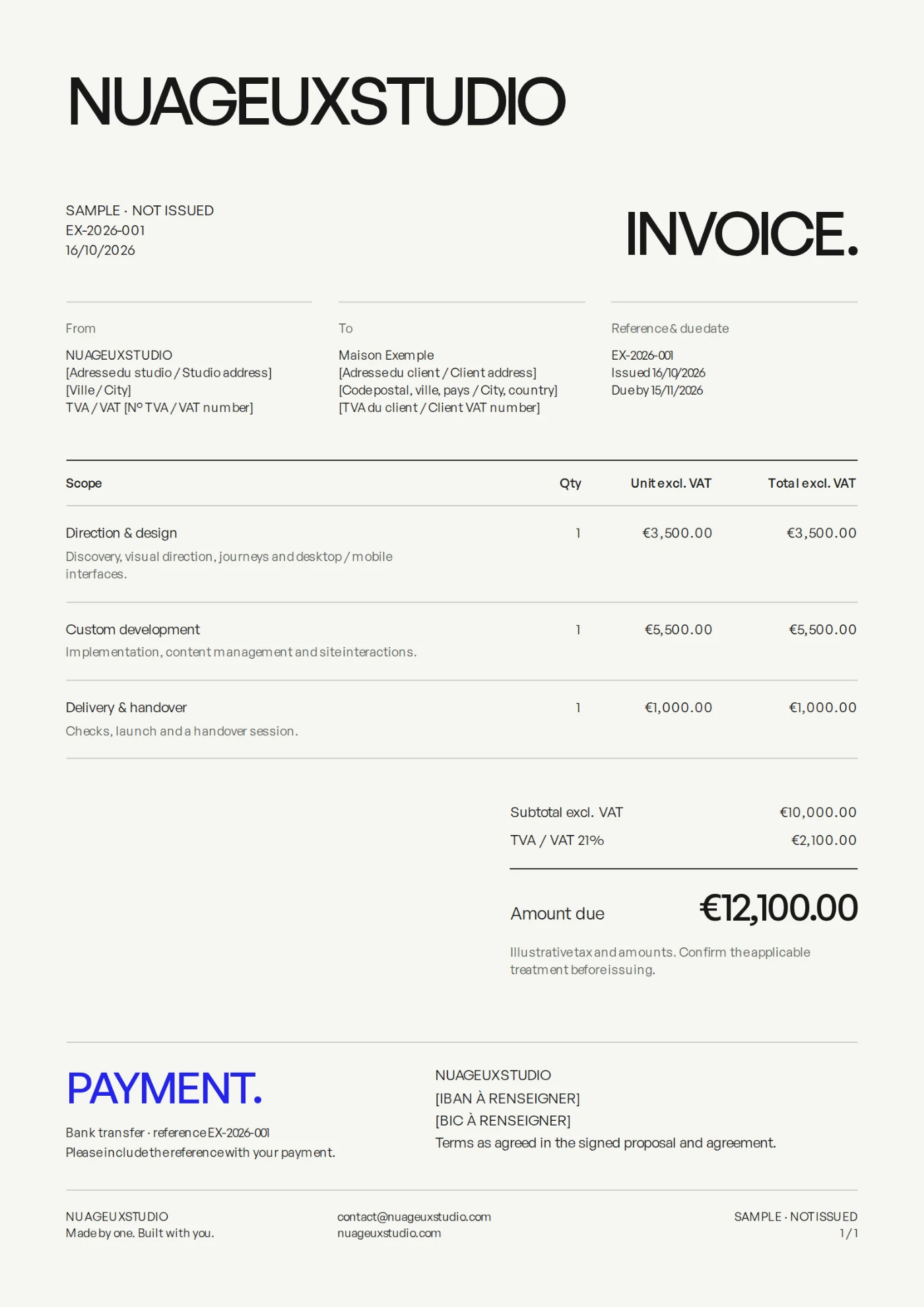
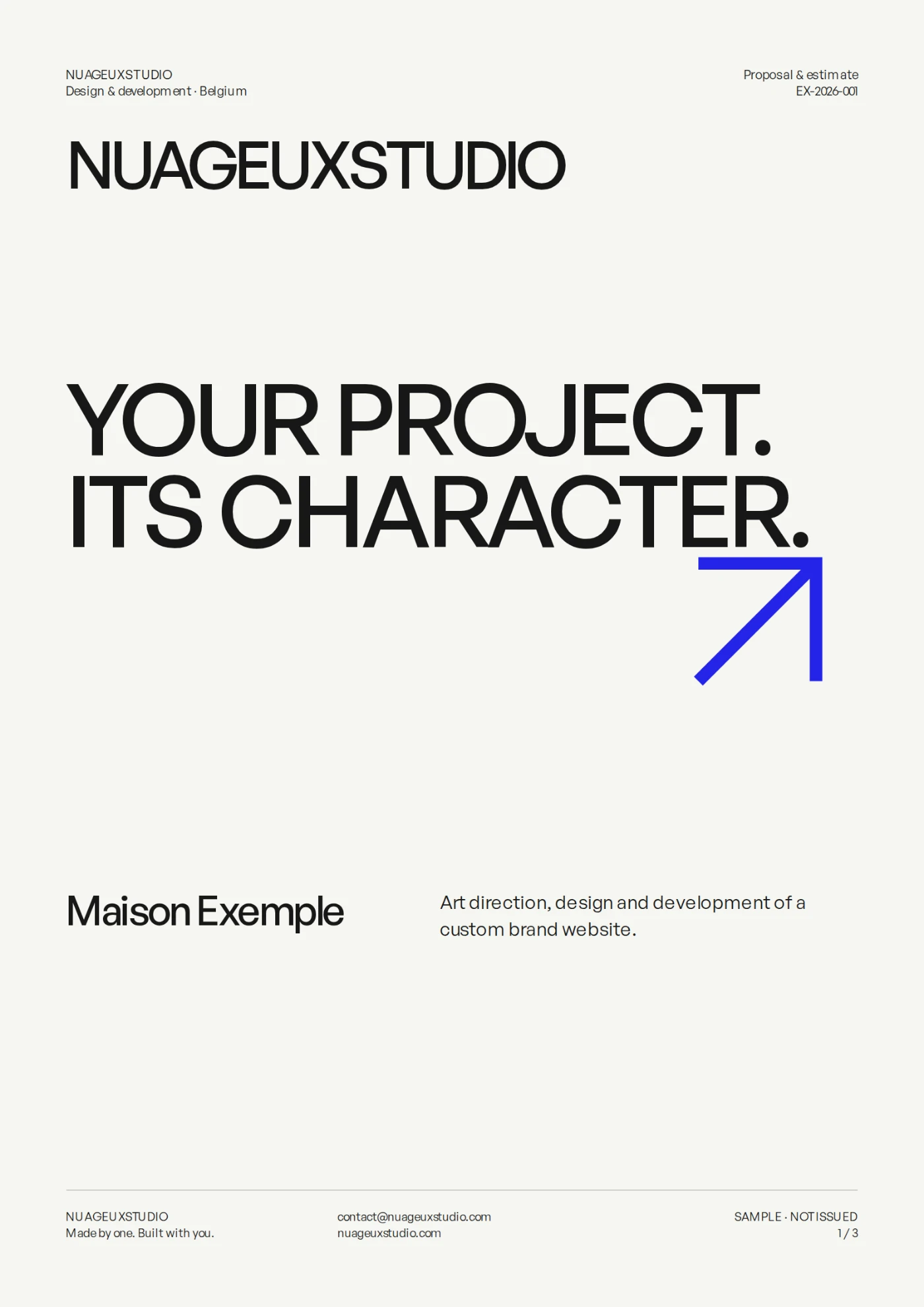
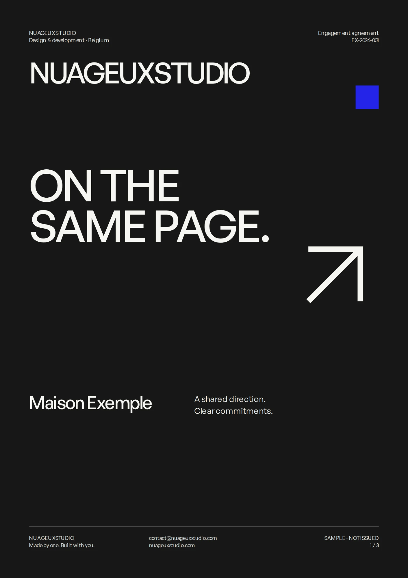
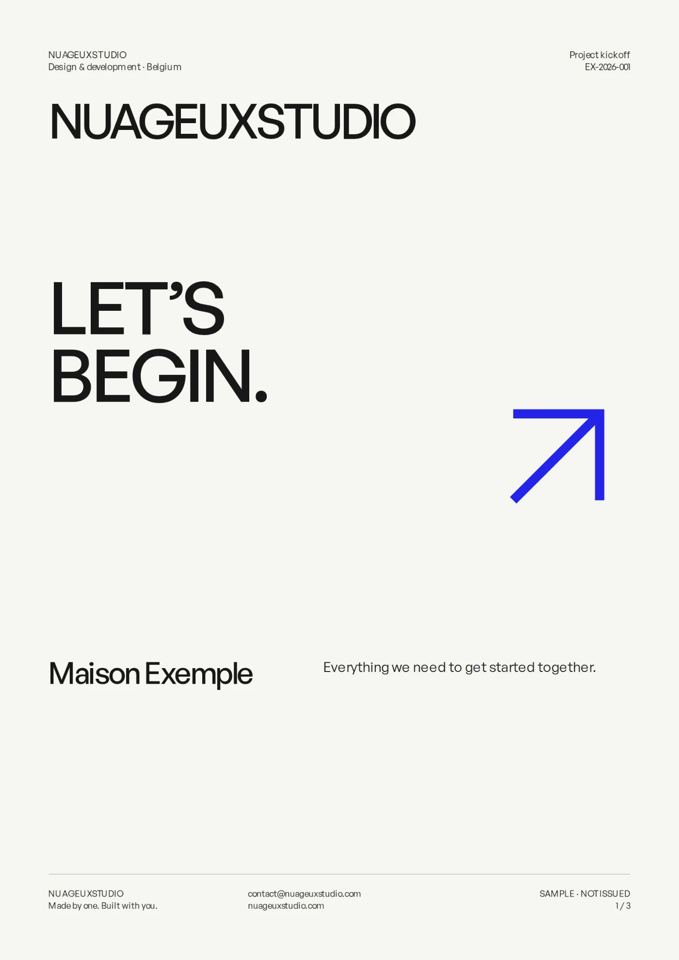
Demonstration templates with illustrative names, amounts and references. These are not documents from actual client engagements.
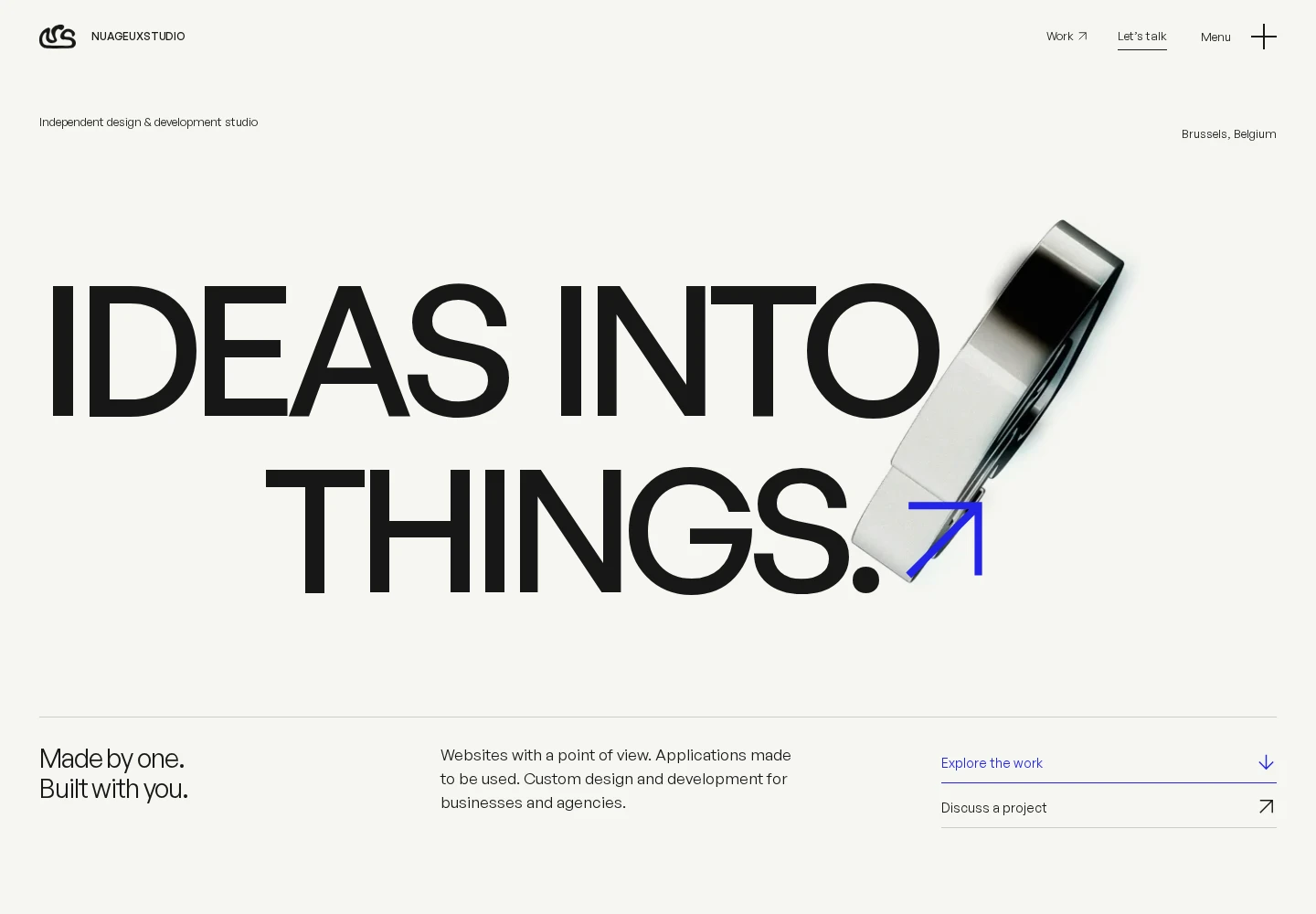
Motion is part
of the language.
The sculptural logo, typographic entrances and page transitions set the rhythm. Projects take centre stage through a lively index and detailed case studies. Navigation stays straightforward.
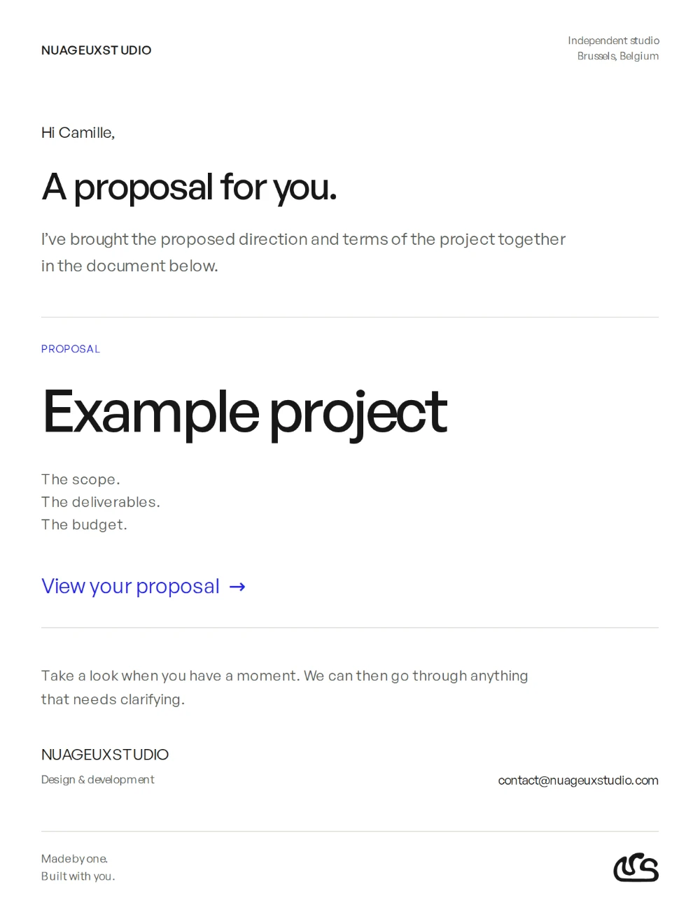
The care continues
in your inbox.
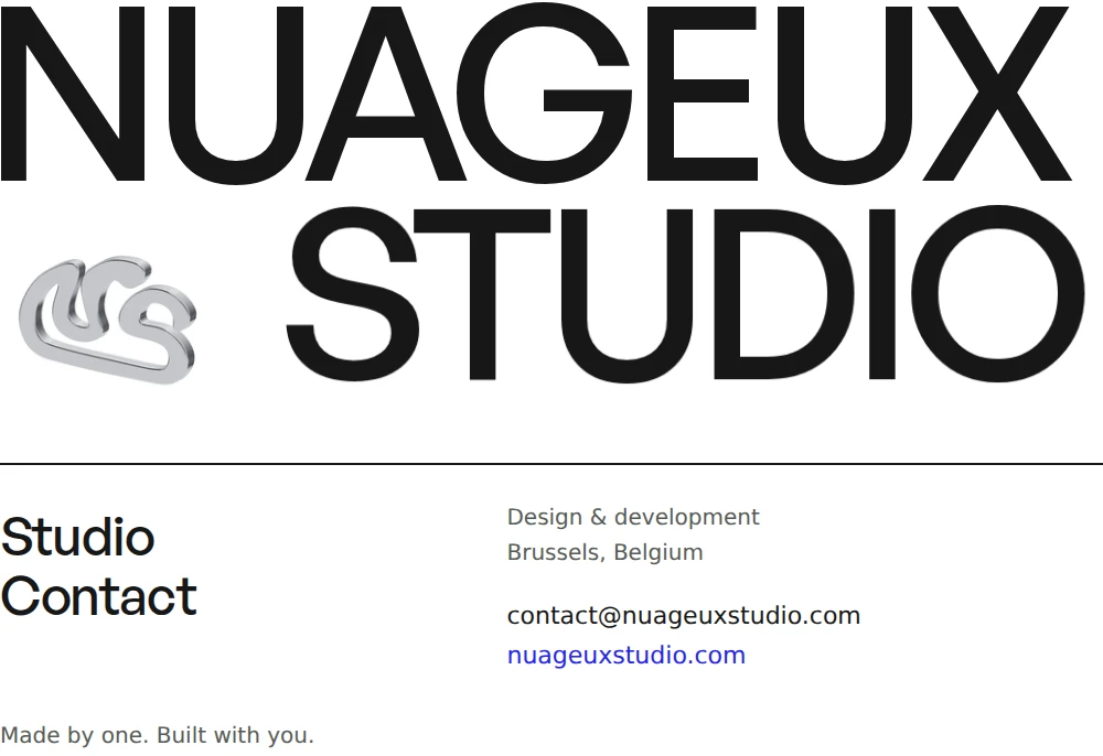
A white background, direct messages and a blue accent for the next action. Emails share the documents’ hierarchy. The signature gives the studio name its own typographic rhythm, alongside the animated symbol.
A recognisable conversation.
The format changes. The voice, hierarchy and attention to detail stay consistent.
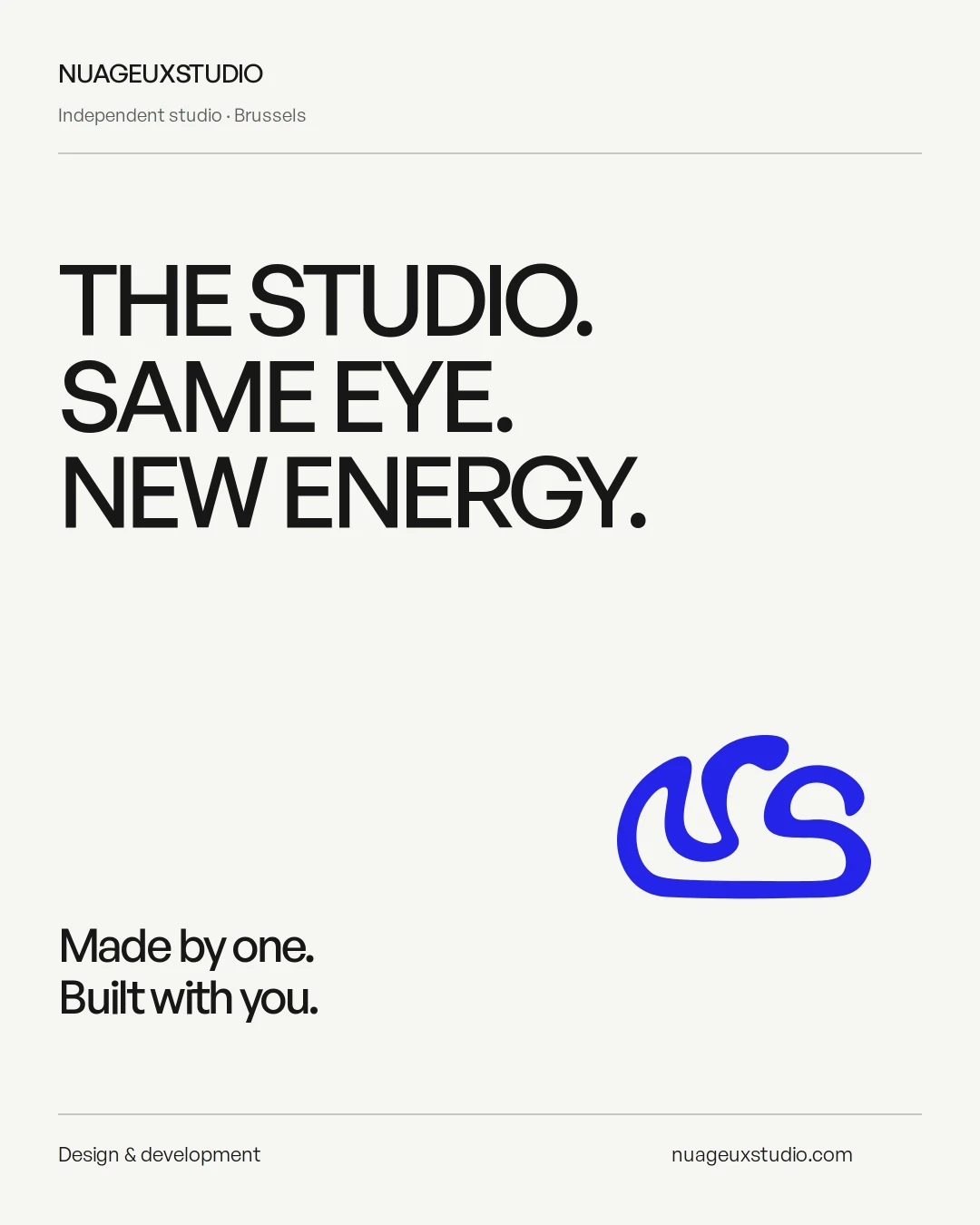
An identity
with room to move.
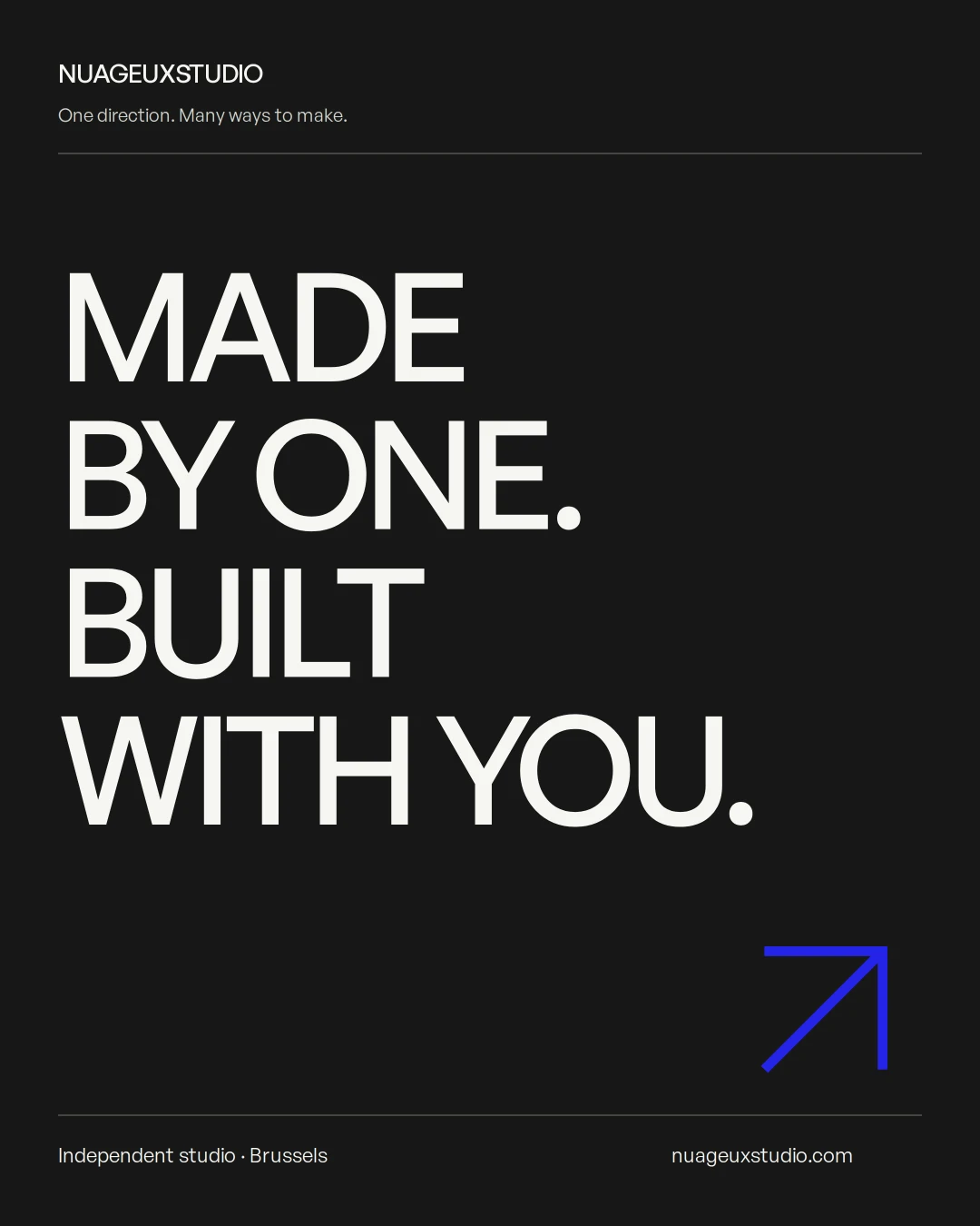
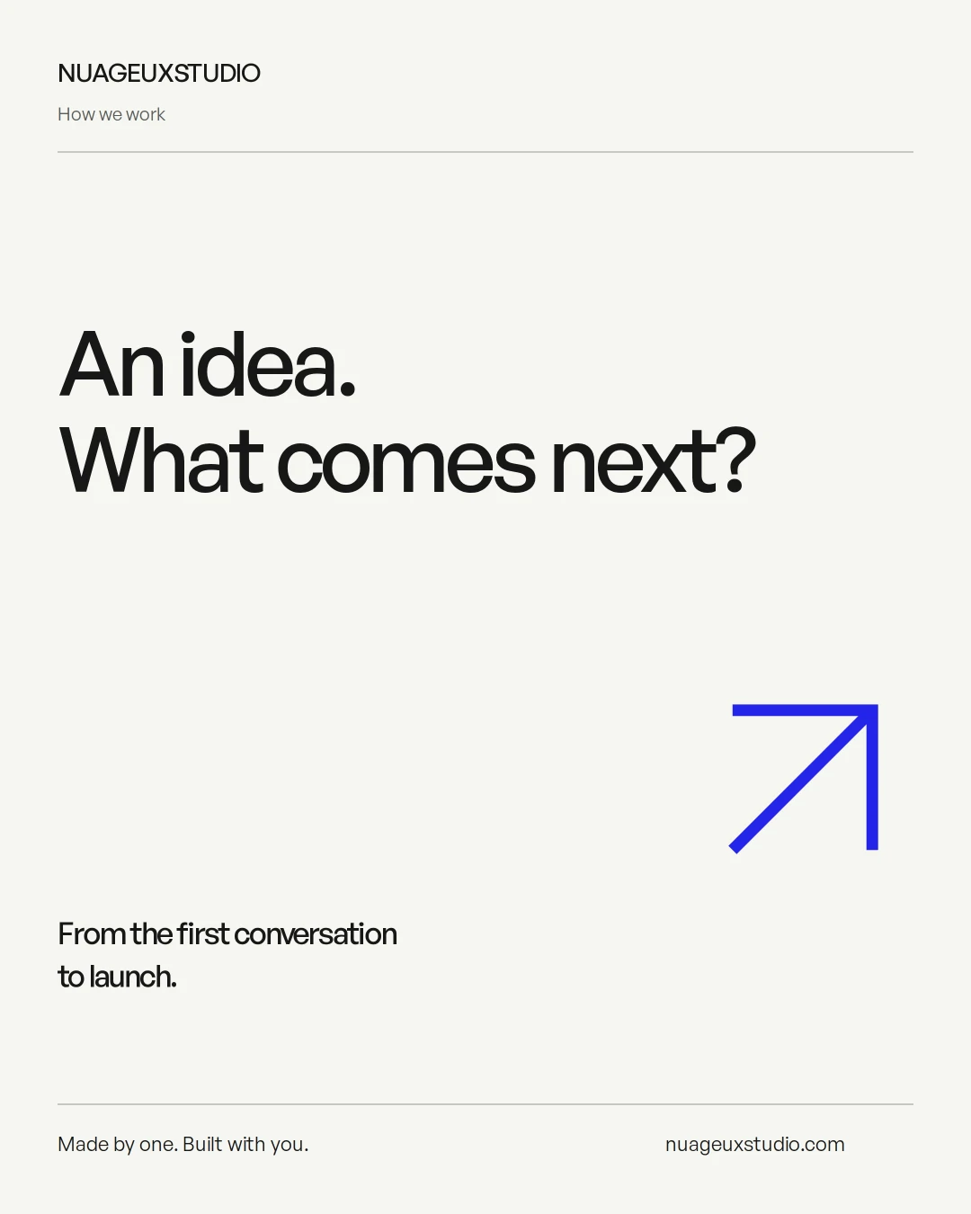
Announce a project, share a process, focus on a detail. Social layouts use the same visual elements and play with scale, with enough freedom to give each message its own composition.
Outcome
One direction.
Built to keep going.
The result is a shared foundation: a bilingual website, composition rules and reusable templates. Each touchpoint can evolve without starting from a blank page every time.
An internal studio redesign. The visuals show the designed applications; presentation mockups are not photographs of issued client documents.
Have a project in mind?
Let’s build what’s next.